mobile app ux Demo

UX & Design Strategy Lead
building products for Banks

with 20+ years experience
Currently leading UX at Wataniya Insurance, Jeddah

Projects Delivered

Two departments were buried in work that customers could do themselves

Wataniya Insurance customers had no way to manage their own policies online. Every add-on request — adding a driver to a car insurance policy, extending geographic coverage, requesting a cancellation — required a phone call or a visit.

This created a compounding problem on two fronts simultaneously: the call centre was handling a relentless volume of routine requests that required no specialist knowledge, and the operations department was manually processing the same requests in their back-end systems, one by one, every single day.

The core tension

"Customers were waiting on hold for tasks they should be able to do in two minutes. Staff were spending their days on data entry instead of actual customer service. Neither side was getting value from the interaction."

Call centre / customer care

Consumed by inbound calls and support tickets for routine policy modifications. High call volume, long wait times, and low-value interactions crowding out complex cases that actually needed human attention.

Operations department

Manually executing hundreds of policy changes per day in back-end systems — repetitive, error-prone, and time-consuming work that could not scale with the company's growth.
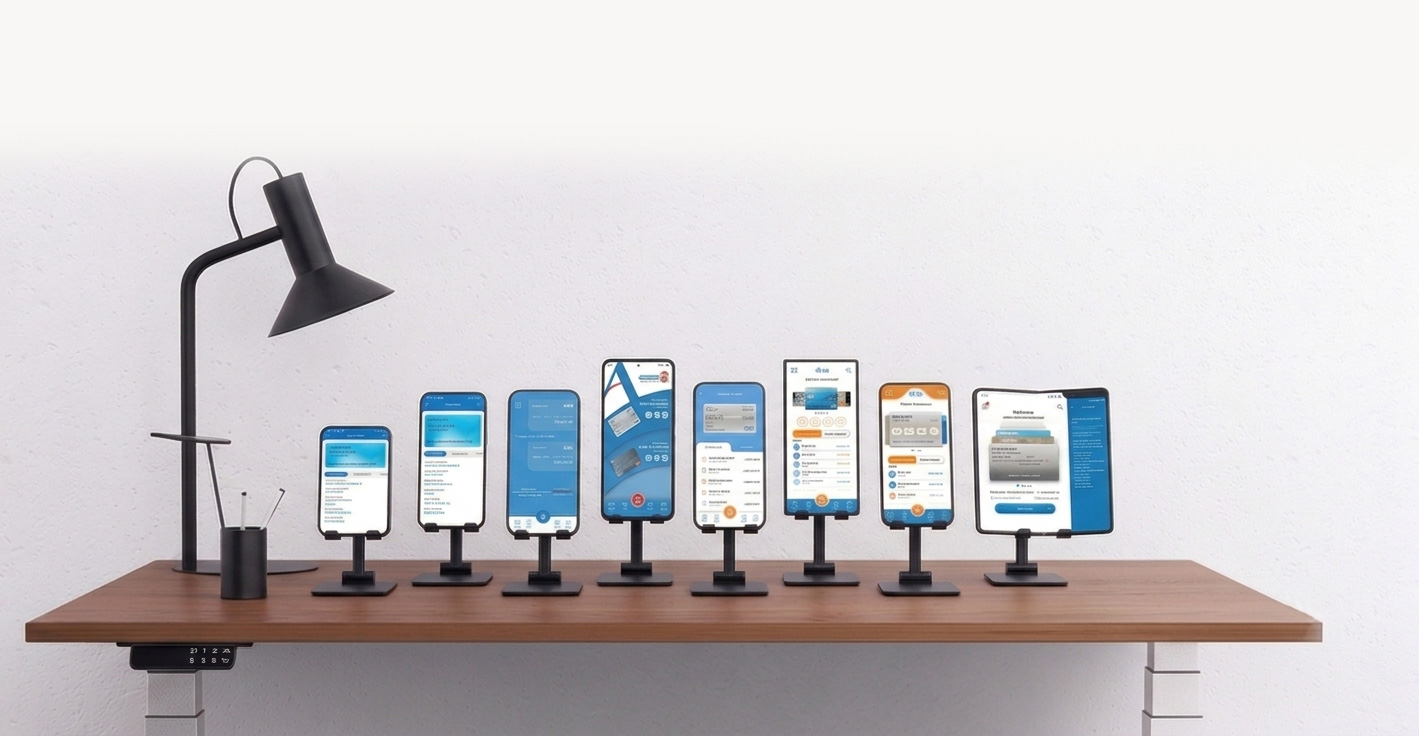
Understanding the problem before designing the solution

Before opening a single design tool, I ran structured research sessions with each affected department. The goal was to map the full picture — not just the surface complaints, but the underlying reasons these problems existed and what a realistic technical solution might look like.

01

Call centre research sessions

Sat with the customer care team to document the most frequent request types, average handling times, and the exact manual steps involved. Identified that driver additions and geographic coverage changes made up the majority of call volume.

02

Operations department mapping

Walked through the back-office workflow step by step with the operations team. Documented each manual touchpoint in the policy modification process — this became the blueprint for what the system needed to automate.

03

Technical discovery with the dev team

Worked with the development team to understand why the self-service capability didn't already exist — whether it was a data access issue, a platform limitation, or a policy constraint. This shaped which features were achievable in the first release.

04

Wireframes and user flow design

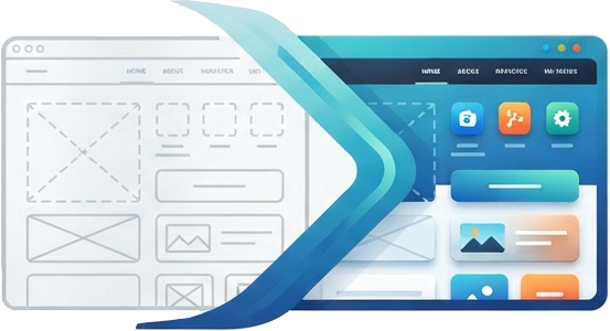
Translated the research into a customer-facing user flow — login, policy overview, action selection, confirmation — then built interactive prototypes for stakeholder review before moving into OutSystems development.

A self-service portal that puts customers in control of their own policies

The solution was to build a dedicated self-service portal where customers could log in with their existing Wataniya account and perform policy modifications themselves — without calling, without waiting, and without involving any member of staff.

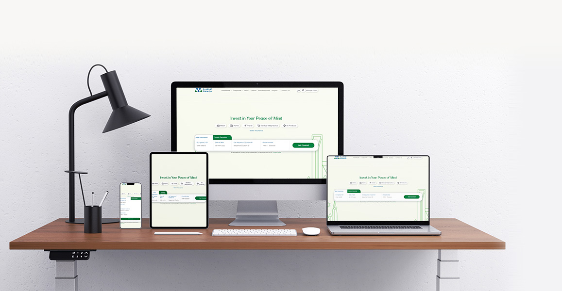
I designed and developed the portal end-to-end on OutSystems, integrating with the eBao insurance platform for policy data. The portal was simultaneously delivered as a web application and as a native mobile app for both iOS App Store and Google Play.

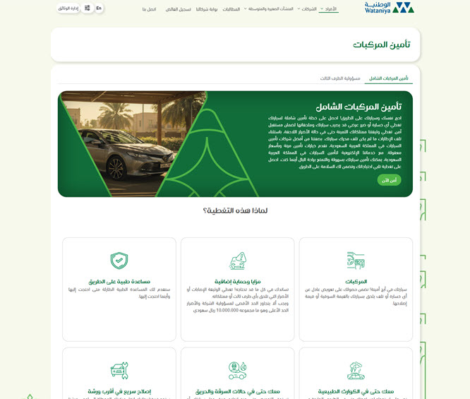
Policy dashboard — a clear, scannable overview of the customer's active policies, renewal dates, and available actions, designed to require no insurance knowledge to navigate.

Driver management — customers can add or remove named drivers from car insurance policies independently, with instant confirmation and no manual processing required.

Geographic coverage add-ons — extending coverage to additional regions or countries, previously a call centre task, available as a self-service flow with clear pricing shown before confirmation.

Policy cancellation flow — a structured, step-by-step cancellation process that gives customers clarity while giving the operations team a consistent, auditable record of every request.

SVG animations and micro-interactions — custom-built motion design to guide users through multi-step flows and provide immediate visual feedback at each confirmation point.

OutSystems eBao HTML5 / CSS3 JavaScript Node JS Cordova Framework 7 SVG Animation Adobe Creative Cloud iOS App Store Google Play

Customers handle their own policies. Staff focus on what matters.

The Self-Service Portal became the first customer-facing digital platform in Wataniya Insurance's history. Customers can now log in and modify their policies independently — at any time, from any device — without needing to contact the company at all for routine changes.

0 Staff needed for routine policy changes
24/7 Customer access, no business hours dependency
2 Live apps shipped: iOS + Android

The customer care team now operates in an oversight and excellence role — monitoring activity, resolving edge cases, and focusing on the complex customer situations that genuinely need a human. The operations team shifted from manual data entry to quality control. Both departments gained time back for work of higher value.

What changed

"The portal didn't just digitise a process — it redistributed how two departments spend their working day. The call centre isn't a bottleneck anymore. Operations isn't a data entry team anymore. That's the outcome I'm proudest of."

What I learned

This was my first project in the insurance industry, and the biggest lesson was understanding how regulatory and compliance requirements shape UX constraints in ways that aren't immediately obvious. Decisions that seemed like unnecessary friction in early design reviews — confirmation screens, re-authentication steps, explicit disclosure text — were driven by insurance regulation and eBao platform requirements rather than design preference.

Learning to design within those constraints rather than against them, and to communicate their rationale to stakeholders clearly, made both the product and the review process considerably smoother in later sprints.

Thumb

Digital Transformation
Delivered!

Complete digital transformation resulting in satisfied customers and millions saved in operational expenses

check it live

A year of development. A finished app. And a UX so broken the bank considered scrapping it entirely.

In 2019, the Saudi government was deep into its Vision 2030 digital transformation agenda — and banking was at the centre of it. The directive was unambiguous: every account-related function must be available through digital channels, with mobile as the priority. Physical branch interactions for routine banking were to become the exception, not the norm.

Arab National Bank responded by launching an in-house mobile app development project on the OutSystems platform — a technology that was new to the development team at the time. After more than a year of work, the technical build was complete. But when users tried to use it, the experience was so confusing and cluttered that the app was functionally useless. Customers couldn't find what they needed. Simple tasks required navigating through layers of poorly organised menus. The app was causing more frustration than it solved.

The brief given to Kamran

"Fix the UX so the app can actually be used — rather than being scrapped in full."

Government mandate

Saudi Vision 2030 required all banks to achieve full digital-channel parity. No core banking function could remain branch-only. Mobile was the stated priority channel.

The existing app's failure

Dozens of functions crammed into an undifferentiated interface with no clear hierarchy. Users were abandoning the app mid-task and calling customer care instead — the exact problem it was built to prevent.

What was at stake

Over a year of development investment and the bank's entire digital transformation credibility. A scrapped app would have meant starting over — with no guarantee the second attempt would be any better.

What was coming

Unknown at the time: a global pandemic was months away. The need for a working mobile banking app was about to become not just a strategic priority — but an essential public service.

Understanding every failure point before changing a single screen

Rather than immediately redesigning screens, I started with structured research across the product, the business, and the competitive landscape. The existing app had real users and real failure patterns — the data was already there, it just needed to be surfaced and understood.

01

Function-by-function pain point mapping

I ran research sessions for each core banking function — transfers, account management, card services, payments — documenting exactly where users were getting lost, what they expected to find and where, and which tasks were being abandoned entirely. This gave me a ranked list of the highest-impact UX failures to address first.

02

Business requirements sessions

Worked with the business team to understand which functions the bank needed customers to adopt most urgently, what compliance constraints shaped certain screens, and where the business had previously made UX compromises to meet technical deadlines. This context was essential for knowing which design decisions had room to move and which didn't.

03

Competitor benchmarking

Analysed the mobile banking apps of leading regional and international banks — studying how they structured information architecture, handled onboarding, and surfaced the most-used functions. This established a benchmark for what Saudi banking customers already expected from a mobile app, not what we assumed they expected.

04

Information architecture redesign

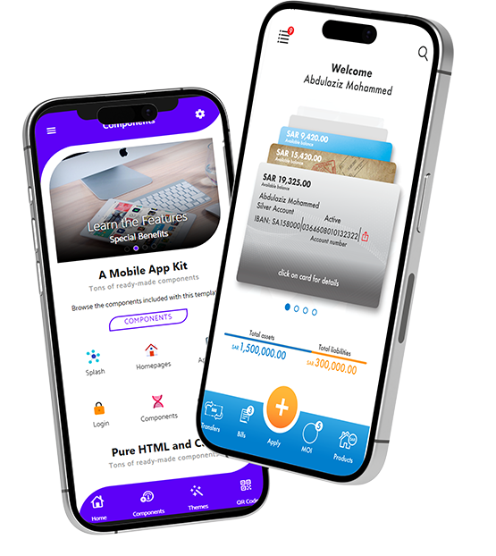
Rebuilt the app's navigation structure from scratch — reducing cognitive load by grouping related functions, surfacing the most-used actions on the home screen, and removing the clutter of secondary features from primary navigation paths. Prototyped and validated the new structure with stakeholders before moving into OutSystems development.

05

Agile delivery on OutSystems

Worked within an Agile sprint methodology — designing, building, and iterating in cycles. As one of the few team members proficient in both OutSystems development and UX design, I bridged the gap between what was designed and what was actually shipped, preventing the design-to-development degradation that had undermined the original app.

A self-explanatory experience that guides users to their goal — without confusion, without calling support

The core design principle was deceptively simple: every user should be able to find any function without asking for help. Not a power-user feature. Not a tutorial. Just a structure clear enough that the right path was always obvious.

This meant ruthlessly prioritising the most common tasks — transfers, balance checks, card management — and making them immediately accessible from the home screen. It meant reducing the number of decisions required to complete each journey. And it meant designing for the specific context of mobile banking in Saudi Arabia: users who might be completing transactions on the go, in Arabic or English, across a range of devices and network conditions.

Restructured information architecture — functions reorganised from a flat, overwhelming list into logical groups that matched how users actually think about their banking, not how the bank's internal systems were organised.

Home screen quick actions — the five most-used functions surfaced directly on the home screen, reducing the average number of taps to complete a common task from six or more to two or three.

Progressive disclosure — advanced features and less-common functions moved to secondary navigation, keeping the primary experience clean without removing functionality that power users needed.

Guided transaction flows — multi-step processes like transfers and card applications redesigned as clear, step-by-step journeys with explicit progress indicators — eliminating the ambiguity that was causing users to abandon tasks mid-flow.

Biometric authentication — seamless Face ID and fingerprint login replacing the friction of manual password entry, reducing the barrier to using the app daily.

SVG animations and micro-interactions — custom motion design for transaction confirmations, loading states, and onboarding — making the app feel responsive and considered rather than static and institutional.

OutSystems Progressive Web App HTML5 / CSS3 JavaScript Node JS Cordova Framework 7 SVG Animation Adobe Creative Cloud InVision iOS App Store Google Play

Shipped into a pandemic. Used by millions. Recognised by five industry bodies.

The new UX was nearly complete when Covid-19 arrived and Saudi Arabia — along with the rest of the world — went into lockdown. Physical bank branches closed or severely restricted access overnight. Mobile banking shifted from a convenience to a necessity in the space of days.

The timing that couldn't have been planned

"We were already very close to finishing the new UX when Covid struck. We delivered it into a world where it was suddenly the only way millions of customers could access their bank at all."

The app launched on both the App Store and Google Play to an overwhelmingly positive public response. For a bank whose internet banking had been optimised for desktop PC use, the mobile app became the primary digital channel almost immediately. Customer care volume for routine banking tasks dropped significantly as users discovered they could complete transactions themselves — on their phones, at any time, without waiting.

2M+ Active customers on the platform
5 Industry awards in the year following launch
#1 Best Mobile Banking App, Saudi Arabia — Global Finance 2021

Global Finance Magazine

Best Mobile Banking App — Saudi Arabia

2021

International Business Magazine

Best Mobile Application — Saudi Arabia

2022

International Business Magazine

Best SME Banking — Saudi Arabia

2022

OutSystems Saudi Arabia Summit

Mobile Excellence Award

2021–2022

Digital Banker Awards

Best Digital Bank — Saudi Arabia

2021

Full award details: outsystems.com/case-studies/anb-mobile-banking-app


2019

Original app built

1+ year in development. Technically complete but UX unusable.

Early 2020

Kamran joins

Hired specifically to rescue and redesign the UX.

March 2020

Covid-19 lockdowns

Mobile banking becomes critical infrastructure overnight.

Late 2020

New UX ships

Launched on App Store and Google Play to strong public response.

2021–22

5 awards

Industry recognition across Global Finance, IBMag, OutSystems.

Thumb

Digital Transformation
Delivered!

Complete digital transformation resulting in satisfied customers and millions saved in operational expenses

check it live

Expertise i bring with me

UX Strategy & Research

Icon
User Research & Usability Testing
Icon
Journey Mapping & Information Architecture
Icon
Stakeholder Workshops, Design Sprints
Icon
Heuristic Evaluation

Design & Prototyping

Icon Icon
UI Design Ideation, Interactive Prototyping
Icon
Design Handoff, Wireframing to High-Fidelity
Icon
Frontend Development

Design Systems & UI Architecture

Icon
Design Systems & Component Libraries
Icon
Style Guides & Pattern Documentation
Icon
Custom SCSS, Bootstrap 5, Tailwind CSS

Platforms & Enterprise Tools

Icon
OutSystems
Icon
SharePoint Portal Server
Icon
CMS Strapi, WordPress, DNN
Icon
Jira/Agile Workflows